Cohort dynamics and diffusion
Source:vignettes/cohort_dynamics_and_diffusion.Rmd
cohort_dynamics_and_diffusion.RmdIntroduction
In this vignette we explore how yearly cohorts of fish evolve over time in a single-species size-spectrum model. We will drive the model with a short burst of reproductive flux once a year, creating distinct cohorts. We will then visualise how these cohorts grow through the size spectrum and how the diffusion rate affects the spreading of the cohorts over time.
Diffusion in the size-spectrum model represents individual variability in growth rates. Without diffusion, all individuals born at the same time grow at the same deterministic rate and remain together as a sharp cohort. With diffusion, individuals spread out in size, causing the cohort to broaden as it ages.
Setting up the model
We start by creating a single-species model using
newSingleSpeciesParams(). This sets up a species embedded
in a power-law background community, so that the encounter rate scales
as \(w^{3/4}\) and the mortality rate
scales as $w^{-1/4}.
params <- newSingleSpeciesParams(h = 10, no_w = 400)Pulsed reproduction
To create distinct yearly cohorts, we need reproduction to happen in short bursts rather than continuously. We achieve this by writing a custom density-dependent reproduction rate function (RDD function) that only allows reproduction during a brief window at the start of each year.
The RDD function receives the current time t as an
argument. We use this to turn reproduction on only during a short window
at the start of each year and off at all other times. To maintain the
same total annual egg production, we scale up the rate during the pulse
to compensate for its short duration.
# Custom RDD function: pulsed reproduction using a fixed rate
pulse_width <- 0.1 # Reproduce during first 10% of each year
annual_pulse_RDD <- function(rdi, species_params, t, ...) {
frac <- t %% 1
if (frac < pulse_width) {
rdd <- rdi # to get vector of right length
rdd[] <- 1 - cos(frac / pulse_width * 2 * pi)
return(rdd)
} else {
return(0 * rdi)
}
}
params <- setRateFunction(params, "RDD", "annual_pulse_RDD")Of course this is not a realistic way to model seasonal reproduction. A more realistic approach is being developed in mizerSeasonal. But it is good enough for our purpose here of studying the evolution of yearly cohorts over time.
Simulating cohort dynamics without diffusion
We start from an empty spectrum (no fish) and let the pulsed reproduction create cohorts from scratch.
initialN(params)[] <- 0
sim_no_diff <- project(params, t_max = 5, dt = 0.01,
t_save = 0.05, progress_bar = FALSE,
method = "predictor-corrector")
animate(sim_no_diff, log_x = TRUE, log_y = FALSE, power = 2, resource = FALSE,
transition_duration = 0, frame_duration = 200)Without diffusion, each cohort peak moves to the right (towards larger sizes) as the fish grow. The width of the cohort stays constant on the logarithmic axis. The growth on the logarithmic axis slows down towards larger sizes and so eventually the older cohorts start to merge.
Adding predation diffusion
Some of the randomness in the growth rate comes from the randomness in the size of prey encountered by the predator. We refer to this as the predation diffusion, even though there are other sources of randomness associated with predation, arising for example from the patchiness in the spatial distribution of prey. So the predation diffusion can be seen as a lower bound on the amount of diffusion arising from randomness in growth. You can find some details in the Diffusion section of the general mizer model description.
params_pred_diff <- params
use_predation_diffusion(params_pred_diff) <- TRUE
sim_pred_diff <- project(params_pred_diff, t_max = 5, dt = 0.01,
t_save = 0.05, progress_bar = FALSE,
method = "predictor-corrector")
animate(sim_pred_diff, log_x = TRUE, log_y = FALSE, power = 2, resource = FALSE,
transition_duration = 0, frame_duration = 200)We see that there is a slight broadening of the cohorts as they grow up, which is most noticeable at larger sizes where they merge together sooner. To see this more clearly we plot the biomass density at time \(t=5\) for both cases:
plotSpectra2(sim_no_diff, sim_pred_diff,
name1 = "No diffusion", name2 = "Predation diffusion",
resource = FALSE, power = 2, log = "x")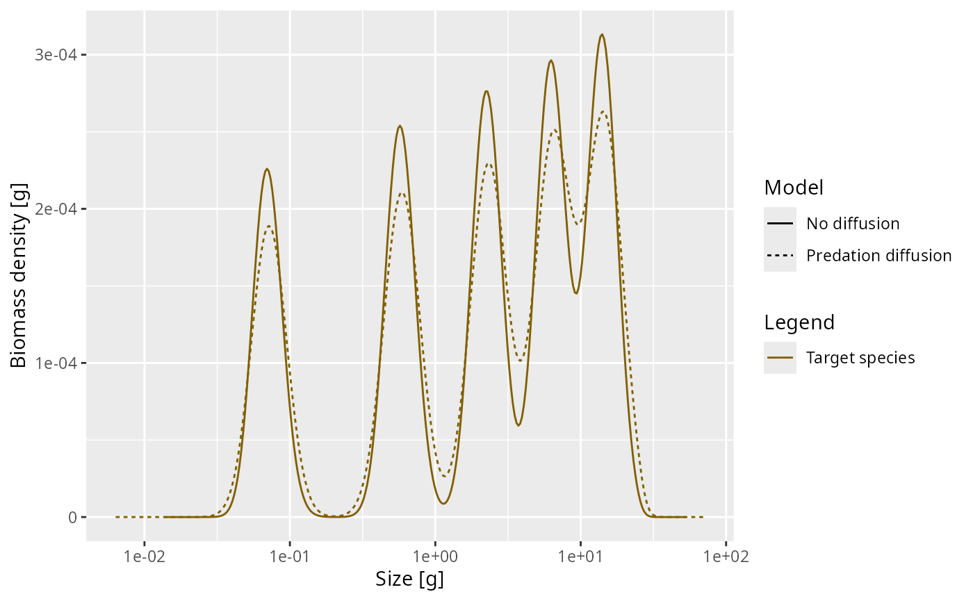
The diffusion rate is a power law in \(w\) with exponent \(7/4\). The coefficient is
(getDiffusion(params_pred_diff) / w(params)^(7/4))[1]## [1] 0.02031864Adding external diffusion
The predation diffusion is the only part of the diffusion that is
explicitly modelled in mizer. We refer to all non-modelled diffusion as
“external” to the model. We assume that it follows the same power law
but with an a priory unknown coefficient that will need to be determined
by looking at the rate at which cohort size distributions widen in the
real world. The coefficient of external diffusion is set with the
species parameter D_ext.
Comparing different diffusion rates
We now run the model with two different levels of external diffusion in order to compare the effects.
species_params(params)$D_ext <- 0.1
sim_medium_diff <- project(params, t_max = 5, dt = 0.01,
t_save = 0.05, progress_bar = FALSE,
method = "predictor-corrector")
species_params(params)$D_ext <- 0.5
sim_high_diff <- project(params, t_max = 5, dt = 0.01,
t_save = 0.05, progress_bar = FALSE,
method = "predictor-corrector")Let’s compare simulations with no diffusion, only predation diffusion, a medium level of diffusion and a level of diffusion at time \(t=5\):
w <- w(params)
snapshot_data <- rbind(
data.frame(x = w, y = finalN(sim_no_diff)[1, ] * w^2,
label = "D = 0 (no diffusion)"),
data.frame(x = w, y = finalN(sim_pred_diff)[1, ] * w^2,
label = "D = 0.02 (predation)"),
data.frame(x = w, y = finalN(sim_medium_diff)[1, ] * w^2,
label = "D = 0.1 (medium)"),
data.frame(x = w, y = finalN(sim_high_diff)[1, ] * w^2,
label = "D = 0.5 (high)")
)
p <- ggplot(snapshot_data, aes(x = x, y = y, colour = label)) +
geom_line(linewidth = 0.8) +
scale_x_log10(limits = c(1e-3, 100)) +
labs(x = "Weight [g]", y = "Biomass density [g]",
title = "Effect of diffusion on cohorts at t = 5",
colour = "Diffusion rate") +
theme_minimal(base_size = 14)
ggplotly(p)We can see that diffusion has a large effect on how quickly the cohorts widen and merge into each other. Let us look at an animation of the high-diffusion case:
animate(sim_high_diff, log_x = TRUE, log_y = FALSE, power = 2, resource = FALSE,
transition_duration = 0, frame_duration = 200)As time progresses, we see that:
- New cohorts enter at the egg size each year.
- Each cohort grows towards larger sizes.
- The diffusion causes each cohort to spread out more and more as it ages.
- Eventually, older cohorts merge together as their spreading overwhelms the year-to-year separation.
Heatmap visualisation
A heatmap provides a compact view of the entire dynamics, showing how the size spectrum evolves continuously over time. Here we look at the case of high diffusion:
sim <- sim_high_diff
all_times <- getTimes(sim)
w <- params@w
n <- N(sim)
heatmap_list <- list()
for (i in seq_along(all_times)) {
n_at_t <- as.numeric(n[i, 1, ])
pos <- n_at_t > 0
if (any(pos)) {
heatmap_list[[length(heatmap_list) + 1]] <- data.frame(
time = all_times[i],
w = w[pos],
log_n = n_at_t[pos] * w[pos]^2
)
}
}
heatmap_data <- do.call(rbind, heatmap_list)
ggplot(heatmap_data, aes(x = time, y = w, fill = log_n)) +
geom_raster(interpolate = TRUE) +
scale_y_log10() +
scale_fill_viridis_c(name = expression(log[10](N))) +
labs(x = "Time [years]", y = "Weight [g]",
title = "Biomass density over time (D = 0.5)") +
theme_minimal(base_size = 14)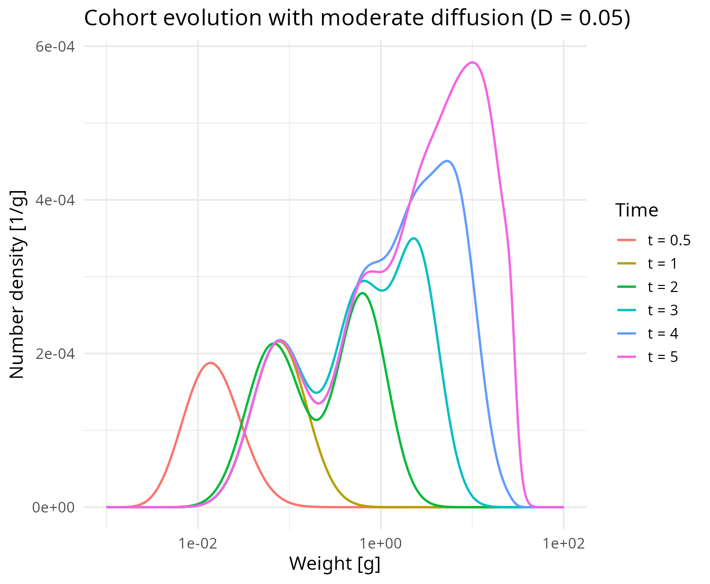
In the heatmap, the diagonal bands represent individual cohorts growing through the size spectrum. The curving of these bands is due to the slowing down and the broadening of these bands with time is the effect of diffusion.
Summary
This vignette demonstrated:
- How to set up a single-species model with
newSingleSpeciesParams(). - How to implement pulsed annual reproduction using a custom RDD function.
- How cohorts of fish grow through the size spectrum over time.
- How diffusion, set via
setExtDiffusion(), controls the spreading of cohorts — representing individual variability in growth rates.