Introduction
In this tutorial we will use the ggplot2 package and the
plotly package for R to visualise the
results from mizer simulations.
Mizer provides several functions for calculating summaries of the
mizer simulation results, see ?summary_functions. Many of
these functions have corresponding plotting functions, see
?plotting_functions. However it is easy to produce
customised plots directly using ggplot() or
plot_ly(). This gives more flexibility than the built-in
plotting functions. Also, you will occasionally want to look at
different quantities for which perhaps there is not built-in plotting
function. In those cases the examples you see below will provide a
useful blueprint.
Both ggplot2 and plotly works with data frames, and the convenient way to manipulate data frames is the dplyr package.
We create a simple simulation that we will use for our examples below.
params <- newMultispeciesParams(NS_species_params)
sim <- project(params, t_max = 10, t_save = 0.5, effort = 0)
From arrays to data frames
Mizer likes to work with arrays indexed by species and time or size.
For example the built-in summary functions return such arrays. These
arrays need to be converted to data frames before they can be
conveniently plotted with either ggplot() or
plot_ly. This conversion is achieved by the function
melt().
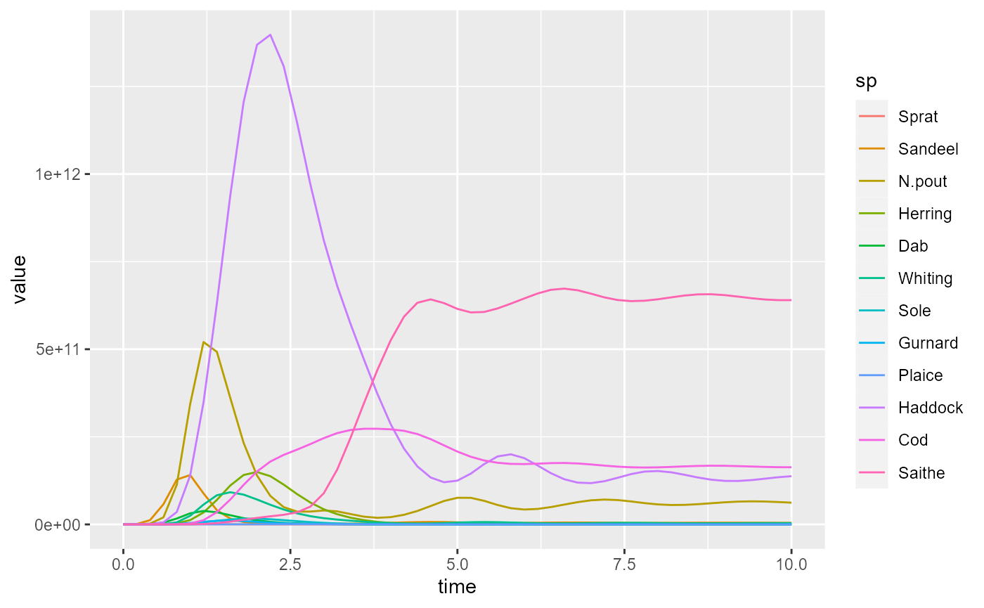
For example, the function getBiomass() returns a
two-dimensional array (matrix) with one dimension corresponding to the
time and the second dimension to the species.
biomass <- getBiomass(sim)
str(biomass)
## num [1:21, 1:12] 8.77e+07 2.52e+09 3.21e+09 7.50e+08 2.09e+08 ...
## - attr(*, "dimnames")=List of 2
## ..$ time: chr [1:21] "0" "0.5" "1" "1.5" ...
## ..$ sp : chr [1:12] "Sprat" "Sandeel" "N.pout" "Herring" ...This array can be converted with the melt() function to
a data frame that contains one row for each entry in the array.
## 'data.frame':    252 obs. of  3 variables:
##  $ time : num  0 0.5 1 1.5 2 2.5 3 3.5 4 4.5 ...
##  $ sp   : Factor w/ 12 levels "Sprat","Sandeel",..: 1 1 1 1 1 1 1 1 1 1 ...
##  $ value: num  8.77e+07 2.52e+09 3.21e+09 7.50e+08 2.09e+08 ...
ggplot2 or plotly
In this form the information can be handed to plot_ly()
and converted to a line plot:
We have specified that the time is plotted along the x axis, the value along the y axis and that the different species are represented by the colours of the lines. Note the American spelling “color” required by plotly.
Alternatively we can do the same thing with
ggplot():
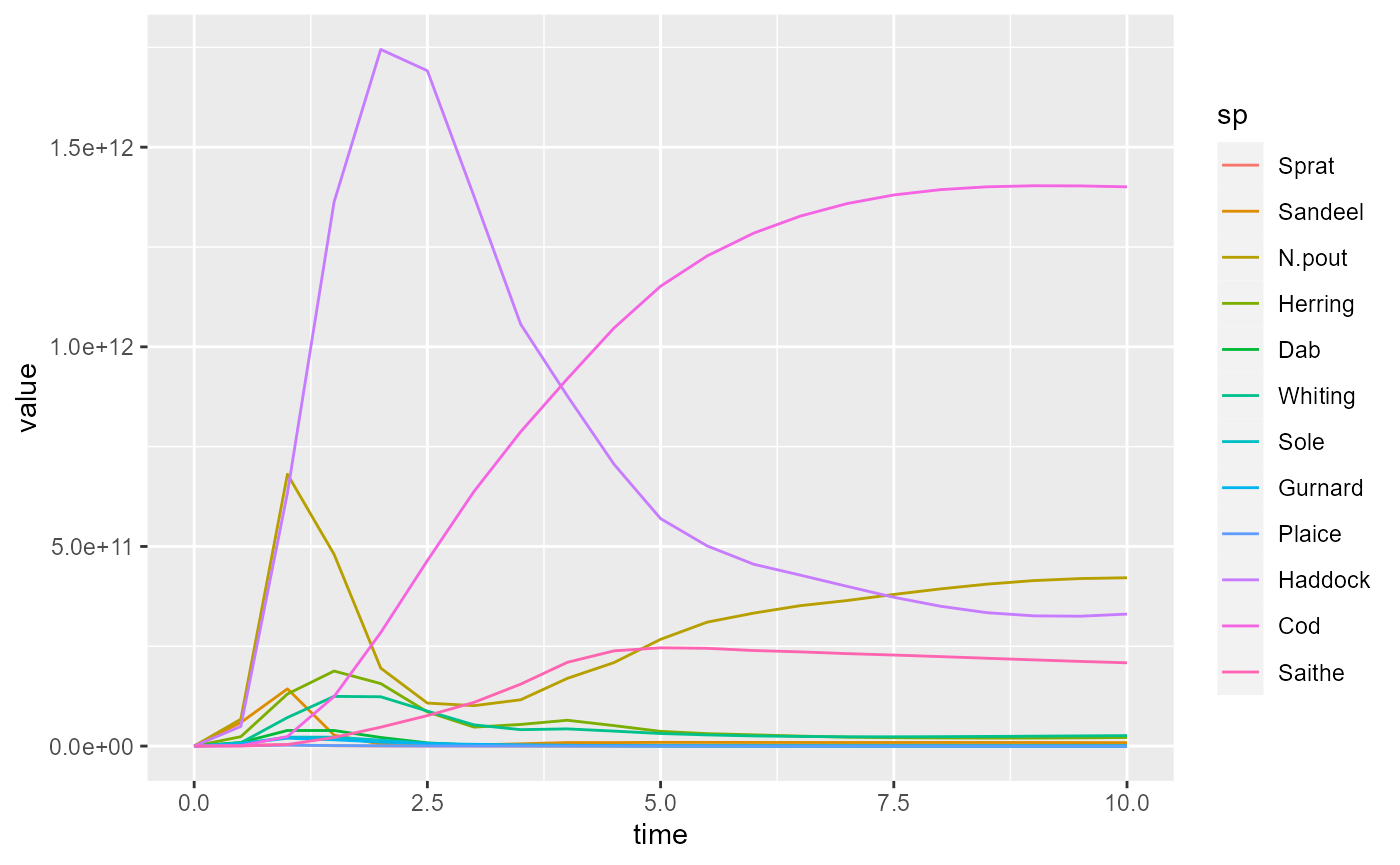
Notice the different syntax for the ggplot2 and for plotly packages. The underlying ideas are similar: they are both implementations of the grammar of graphics. I recommend learning ggplot2 first, and switching to plotly only when it has clear advantages (in particular for animations, see below).
The main advantage of plotly, namely the interactivity of the
resulting figures, can be obtained also with the ggplot syntax by
running the result of ggplot() through the function
ggplotly():
ggplotly(pg)Below we will always for each plot first give the ggplot code and then the plotly code.
Adding labels
We may want to add labels to the figure and to each of the axes. In
ggplot this is done with labs().
pg + labs(title = "Biomass plot",
          x = "Time [years]",
          y = "Biomass [g]")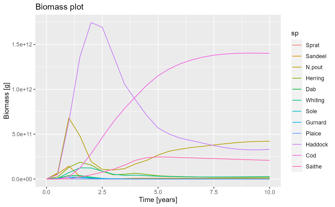
In plotly we use the layout() function.
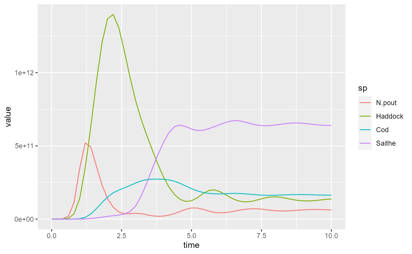
Filtering out data
We can use the filter function to filter out some of the data. For example we could select only the data for specific species:
Now if we plot this reduced data frame we get
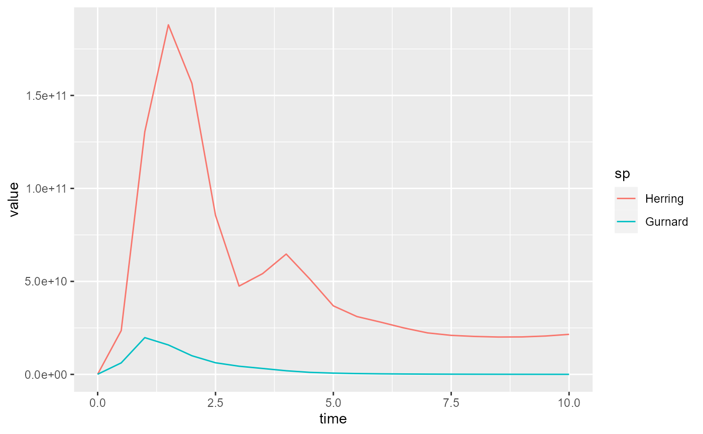
In the above we first converted the array to a data frame with
melt() and then selected the data of interest with
filter(). We could alternatively have first selected only
the desired entries in the array and then created the data frame with
melt() from the resulting smaller array:
nfr <- melt(getBiomass(sim)[, c("Gurnard", "Herring")])
ggplot(nfr) +
    geom_line(aes(x = time, y = value, color = sp))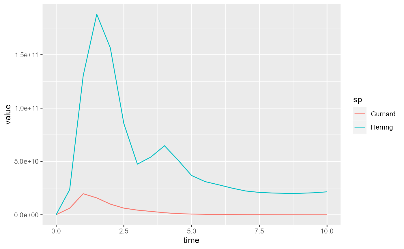
The result looks almost identical, except that the colours associated to the species have changed.
Specifying line colours
If we want to make sure the same species always has the same colour, we can use the colours specified by the MizerParams object
getColours(params)## Sprat Sandeel N.pout Herring Dab Whiting Sole
## "#815f00" "#6237e2" "#8da600" "#de53ff" "#0e4300" "#430079" "#6caa72"
## Gurnard Plaice Haddock Cod Saithe Resource Total
## "#ee0053" "#007957" "#b42979" "#142300" "#a08dfb" "green" "black"
## Background Fishing External
## "grey" "red" "grey"To use these colours in ggplot we add
scale_colour_manual():
ggplot(biomass_frame) +
    geom_line(aes(x = time, y = value, color = sp)) +
    scale_colour_manual(values = getColours(params))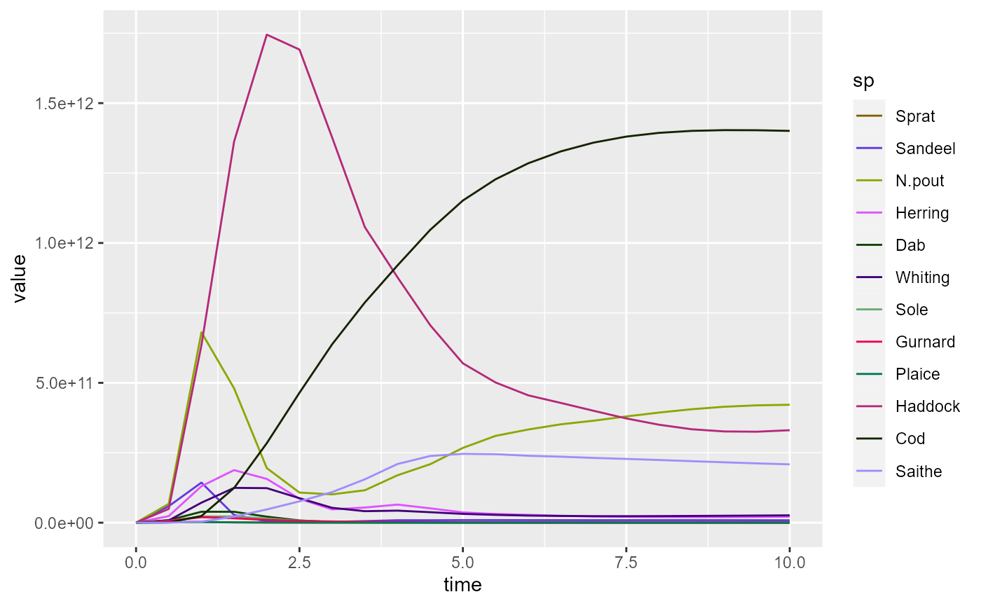
In plotly we add colors = getColours(params)r to the
add_lines() command:
plot_ly(biomass_frame) %>%
    add_lines(x = ~time, y = ~value, color = ~sp,
              colors = getColours(params))
Again note the American spelling “colors” required by plotly.
Plotting spectra
Of course mizer has the plotSpectra() function for
plotting size spectra. Again it is instructional to create such plots by
hand.
We can access the abundance spectra of the species via
N(sim). This is a three-dimensional array (time x species x
size). Let us first look at the abundance at the final time.
The drop = FALSE means that the result will again be a 3
dimensional array.
str(final_n)## num [1, 1:12, 1:100] 1.92e+06 4.81e+12 1.15e+14 3.86e+12 1.12e+11 ...
## - attr(*, "dimnames")=List of 3
## ..$ time: chr "10"
## ..$ sp : chr [1:12] "Sprat" "Sandeel" "N.pout" "Herring" ...
## ..$ w : chr [1:100] "0.001" "0.00119" "0.00142" "0.0017" ...We use the melt() function to convert this array into a
data frame.
nf <- melt(final_n)This has created a data frame with 4 variables and one observation
for each of the 1200 entries in the 1 x 12 x
rdim(final_n)[3] matrix final_n.
str(nf)## 'data.frame': 1200 obs. of 4 variables:
## $ time : int 10 10 10 10 10 10 10 10 10 10 ...
## $ sp : Factor w/ 12 levels "Sprat","Sandeel",..: 1 2 3 4 5 6 7 8 9 10 ...
## $ w : num 0.001 0.001 0.001 0.001 0.001 0.001 0.001 0.001 0.001 0.001 ...
## $ value: num 1.92e+06 4.81e+12 1.15e+14 3.86e+12 1.12e+11 ...The first three variables take their values from the dimension names
of the array. Of course the time variable is the same for all
observations, because we selected these before creating the data frame.
The fourth variable called value is the value of the entry
of the array, so the abundance density in our case.
There are a lot of entries with value 0, which we are not really interested in, so it makes sense to remove them:
nf <- filter(nf, value > 0)This leaves a data frame with only 945 observations.
We can send this data frame to ggplot and add a line for the spectrum for each species, with a different colour for each, and specify that we want both the x axis and the y axis to be on a logarithmic scale.
pg <- ggplot(nf) +
    geom_line(aes(x = w, y = value, color = sp)) +
    scale_x_log10() +
    scale_y_log10()
pg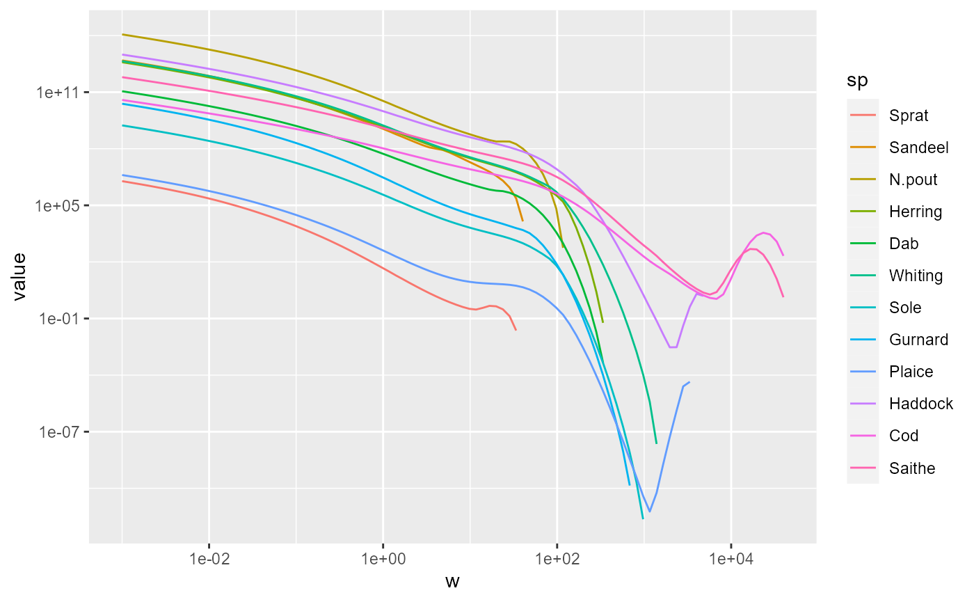
The corresponding syntax for plotly is
p <- plot_ly(nf) %>%
    add_lines(x = ~w, y = ~value, color = ~sp) %>%
    layout(xaxis = list(type = "log", exponentformat = "power"),
           yaxis = list(type = "log", exponentformat = "power"))
p
In the above we used the pipe operator %>% which
feeds the return value of one function into the first argument of the
next function.
Including resource spectrum
We can include additional lines in the plot by merging several data frames. For example, we can include another line for the resource spectrum. We first convert also the resource abundance at the final time into a data frame and filter out the zero values
This data frame only contains three variables, because it does not
have the sp column specifying the species. We add this
column with the value “Resource”
nf_pp$sp <- "Resource"Now this new data frame has the same columns as the data frame
nf and the two can be bound together
nf <- rbind(nf, nf_pp)Using this extended data frame gives the following plot:
p <- ggplot(nf) +
    geom_line(aes(x = w, y = value, color = sp)) +
    scale_colour_manual(values = getColours(params)) +
    scale_x_log10() +
    scale_y_log10()
p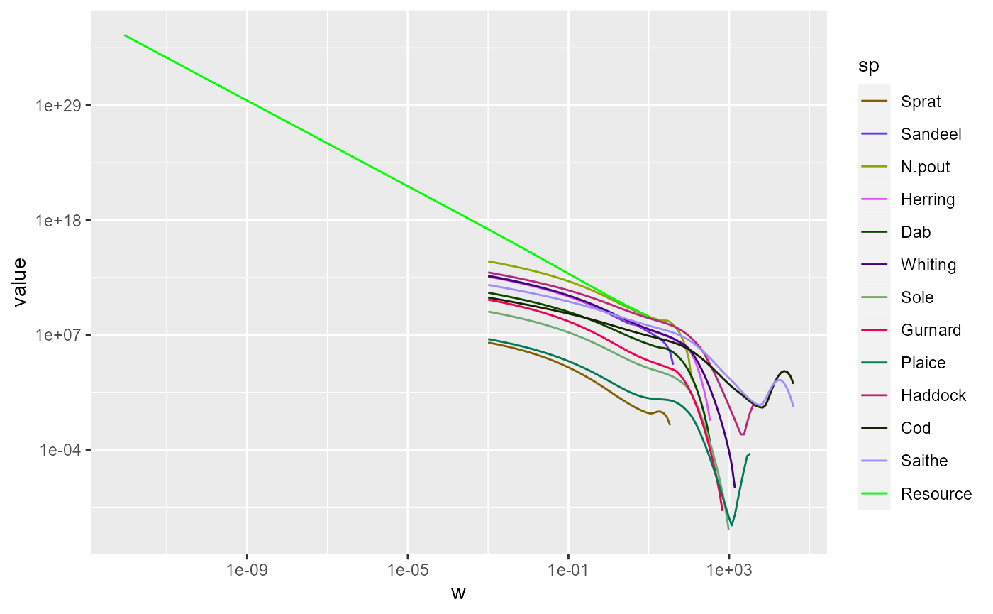
Of course we could use the same data frame also with plotly.
Limiting the axes
We might want to zoom in on the part that includes the fish. There
are three ways to achieve this. The first is to use
filter() to filter out all the rows in the data frame that
have small w and then plot the resulting data frame as usual:
nf %>%
    filter(w > 10^-4) %>%
    ggplot() +
    geom_line(aes(x = w, y = value, color = sp)) +
    scale_colour_manual(values = getColours(params)) +
    scale_x_log10() +
    scale_y_log10()
The second method is to specify limits for the axes. In ggplot this
is done by adding limits to the axis scales:
ggplot(nf) +
    geom_line(aes(x = w, y = value, color = sp)) +
    scale_colour_manual(values = getColours(params)) +
    scale_x_log10(limits = c(10^-4, NA)) +
    scale_y_log10(limits = c(NA, 10^20))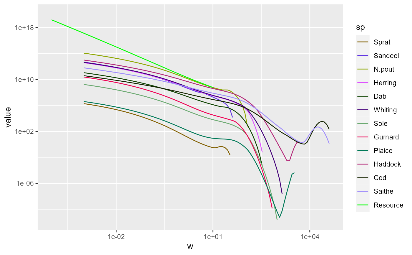
The NA means that the existing limits are kept.
In plotly we specify the range as follows:
plot_ly(nf) %>%
    add_lines(x = ~w, y = ~value, color = ~sp,
              colours = getColours(params)) %>%
    layout(xaxis = list(type = "log", exponentformat = "power",
                        range = c(-4, 4)),
           yaxis = list(type = "log", exponentformat = "power",
                        range = c(-14, 20)))
Note how in plotly the range is specified by giving the logarithm to base 10 of the limits.
Animating spectra
Instead of picking out a specific time we can ask plotly to make an
animation showing the changing spectra over time. So we melt the entire
N(sim) array and use the time variable to specify the
frames with the frame = ~time argument to
add_lines():
melt(N(sim)) %>%
    filter(value > 0) %>%
    plot_ly() %>%
    add_lines(x = ~w, y = ~value,
              color = ~sp, colors = getColours(params),
              frame = ~time,
              line = list(simplify = FALSE)) %>%
    layout(xaxis = list(type = "log", exponentformat = "power"),
           yaxis = list(type = "log", exponentformat = "power"))
Note how this produces a smooth animation in spite of the fact that
we saved the abundances only once a year. That interpolation is
facilitated by the line = list(simplify = FALSE)
argument.
The ggplot package does not provide a similarly convenient way of creating animations. There is the gganimate package, but it is not nearly as convenient.
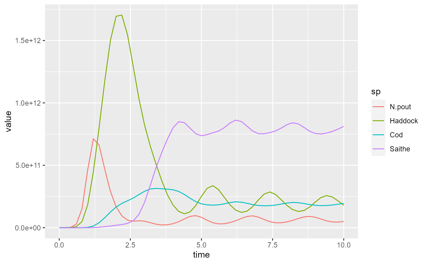
Comparing simulations
We may also want to make plots contrasting the results of two different simulations, for example with different fishing policies. To illustrate this we create two simulations with different fishing effort:
sim1 <- project(params, t_max = 10, t_save = 0.2, effort = 2)
sim2 <- project(params, t_max = 10, t_save = 0.2, effort = 4)
Let us look at a plot of the fishing yield against time. This is
calculated by the getYield() function, which returns an
array (time x species) that we can convert to a data frame
Let’s look at the plot of the yield from the first simulation:
To make the plot less cluttered, we keep only the 4 most important species
yield1 <- filter(yield1, sp %in% c("Saithe", "Cod", "Haddock", "N.pout"))
yield2 <- filter(yield2, sp %in% c("Saithe", "Cod", "Haddock", "N.pout"))
and plot again
For simulation 2 the plot looks like this:
Comparison will be easier if we combine these two plots. For that we add an extra variable to the data frames that allow us to distinguish them and then we merge them together.
In ggplot we can now use facet_grid() to put the plot
for each value of effort side-by-side:
ggplot(yield) +
    geom_line(aes(x = time, y = value,
                  colour = sp)) +
    facet_grid(cols = vars(effort))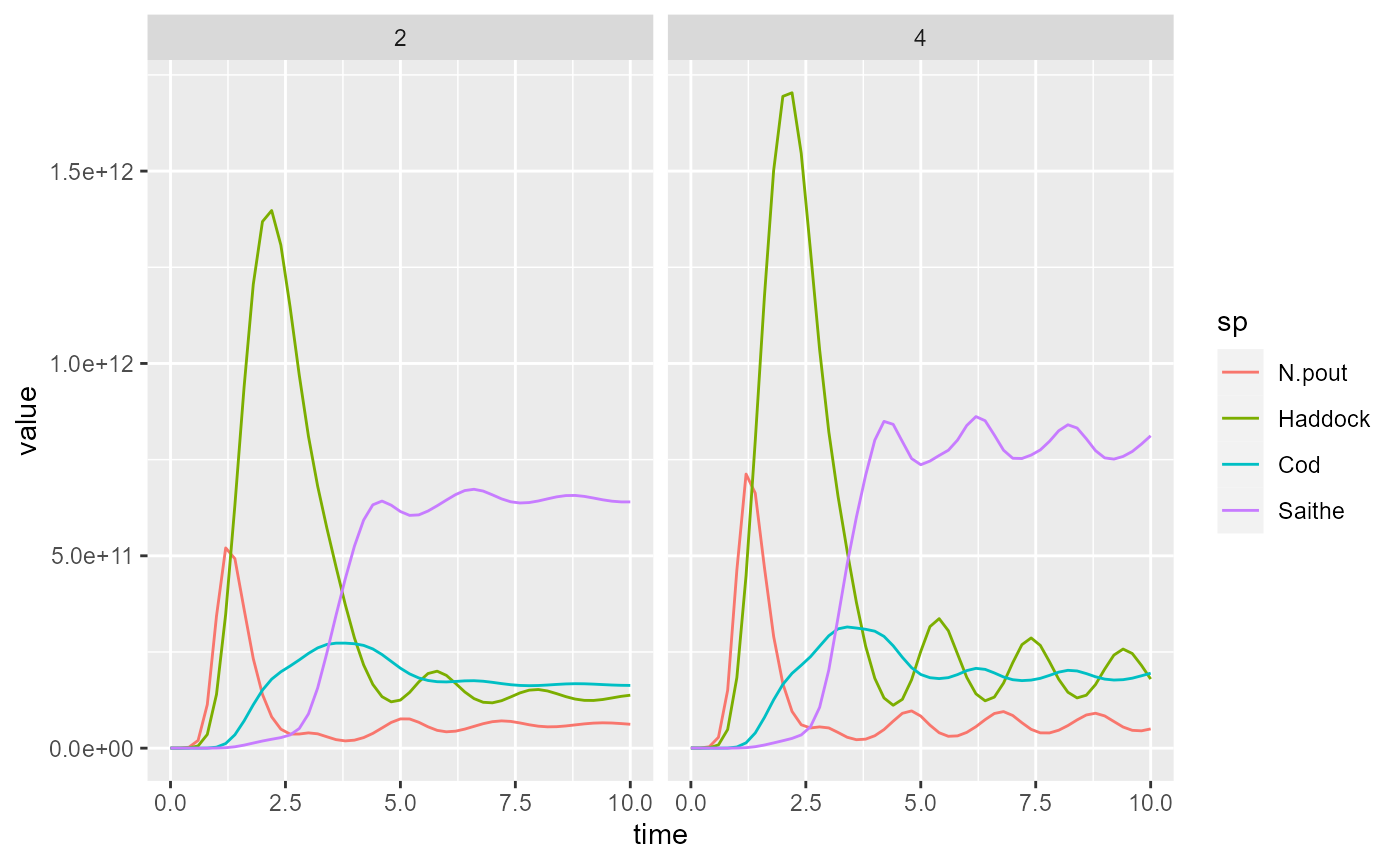
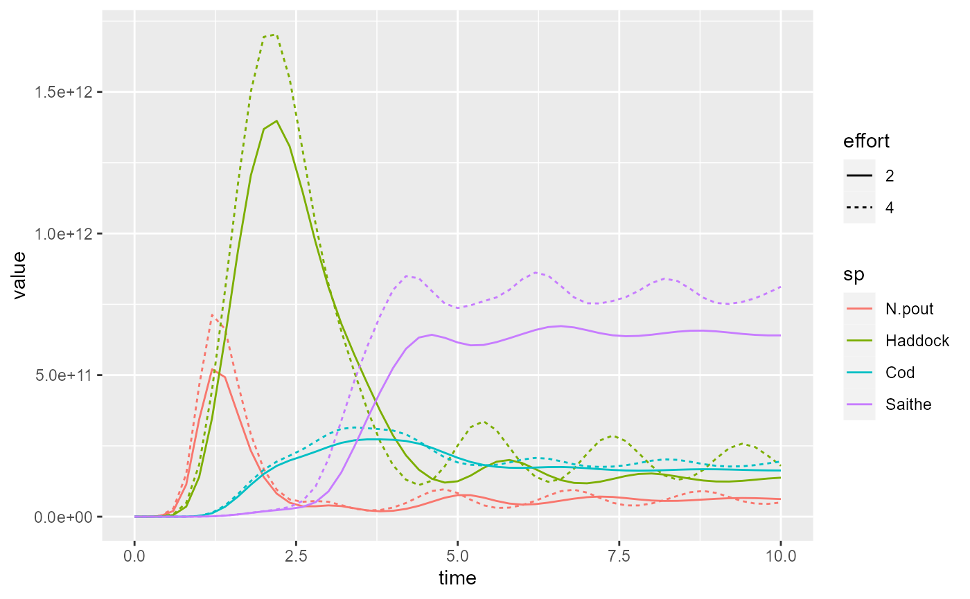
Or we can use the linetype aesthetic to represent the
different effort values by different line types:
plotly is less good at faceting, but it can put arbitrary plots
side-by-side (or arrange them into a grid) with
subplot()
subplot(p1, p2, shareX = TRUE, shareY = TRUE)Note how the shareY = TRUE argument to
suplot() makes sure the two plots use the same scale on the
y axis, and similarly for shareX = TRUE.
Also in plotly we can now tie the effort variable to the
line type.
Arguably, ggplot2 does a nicer job in this case.